Drop4you is an e-commerce product for purchasing original sneakers with delivery to Russia.
I joined the project at an early stage as a UI designer: the only existing visual asset was the logo.
Everything else — structure, visual language, interfaces, and interaction behavior — was designed by me from scratch and brought to a production-ready state.
The goal was to build a full-featured online store capable of supporting complex user scenarios:
size selection, brand and collection browsing, delivery configuration, split payments, personal accounts,
discounts, and post-purchase interaction.
At the same time, the product could not feel like a generic template — it needed a distinct character and recognizability.
Visual foundation
One of the key visual decisions was the use of chamfered corners in cards and promo blocks.
This approach emerged during early style exploration and was initially treated as an experiment.
It proved successful: it added visual rhythm and motion and became a recognizable element of the interface.
As a result, the chamfer was adopted by the team and fixed as part of the brand language.
It is used selectively — in promo cards, campaigns, and recommendation blocks —
without compromising the cleanliness of the core interface.
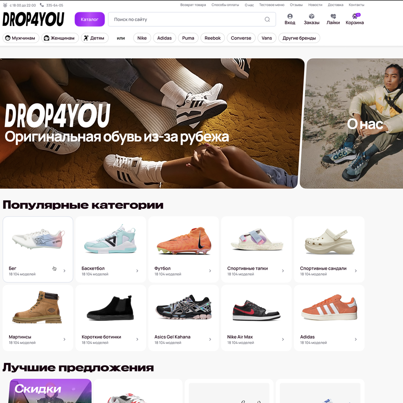
Home page
Product architecture
I designed all key user scenarios of the online store:
— home page with navigation by categories, brands, and curated selections;
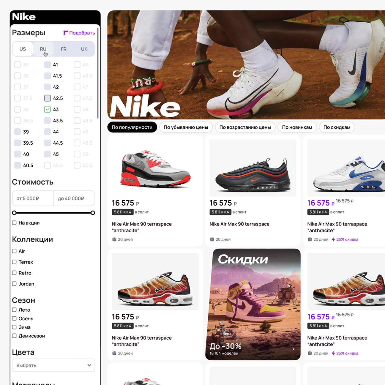
— product listings with filtering and sorting;
— product detail pages with size selection, delivery, and payment;
— cart and checkout flow;
— personal account with orders, addresses, discounts, and subscriptions;
— supporting content sections.
Interface elements behave consistently across all screens:
button states, toggles, filters, and inputs remain predictable and do not require re-learning when moving between sections.
The catalog is built as a flexible system rather than a flat list of products.
Users can filter by size, price, collections, seasons, materials, and colors.
Sizes are presented in multiple scales, with clear and explicit switching between them.
Filters work synchronously with listings and update results instantly,
without intermediate screens or page reloads.
Listing
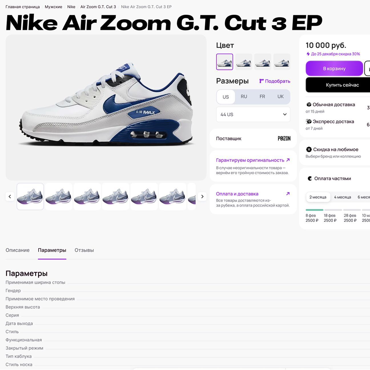
Product page
The product page is designed around the primary action — purchase.
All secondary information is available but does not interfere with decision-making.
The page includes:
— color and size selection;
— add to cart and favorites;
— quick access to checkout;
— delivery options with pricing;
— split payment integration (Yandex Split) with automatic recalculation;
— size charts and related products;
— reviews and ratings.
The interface maintains a balance between information density and visual clarity,
avoiding the feel of an overloaded product sheet.
Product
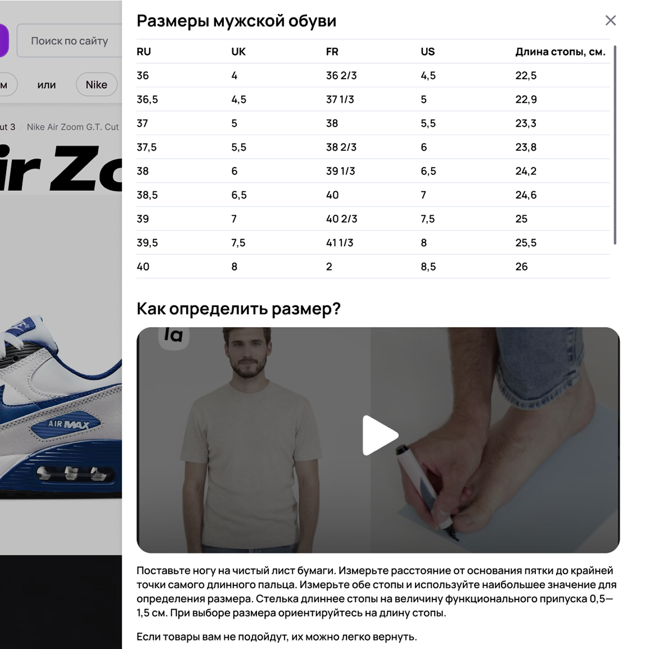
Size selection
Size selection is handled as a separate scenario.
Users see a conversion table and can immediately watch a video guide on how to measure their foot correctly.
This reduces returns and increases confidence at the moment of purchase.
Size guide
Recommendations
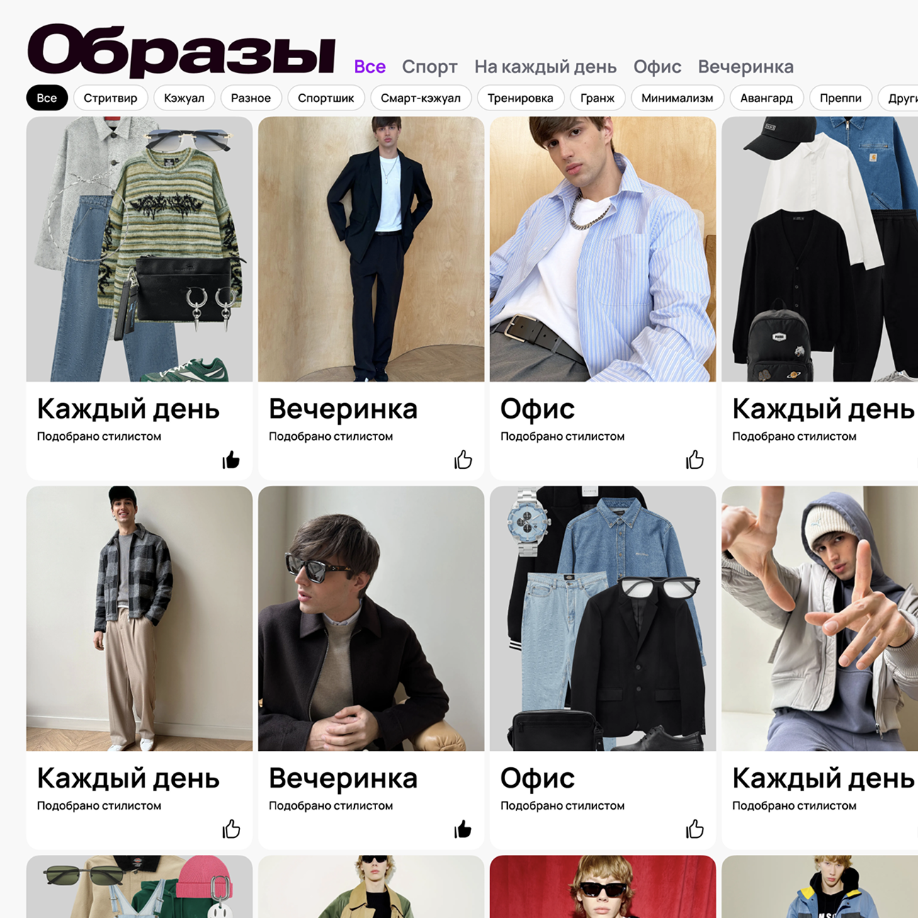
The product includes a dedicated outfit recommendation scenario.
This is not a simple product showcase but a recommendation layer built on top of the catalog.
Users switch between styles (“Everyday”, “Office”, “Party”, etc.)
using radio-like controls, without page reloads.
Outfit cards support likes, dynamically update recommendations,
and link directly to curated product selections.
The catalog gains a content-driven layer and stops being linear.
Recommendations
Gift cards
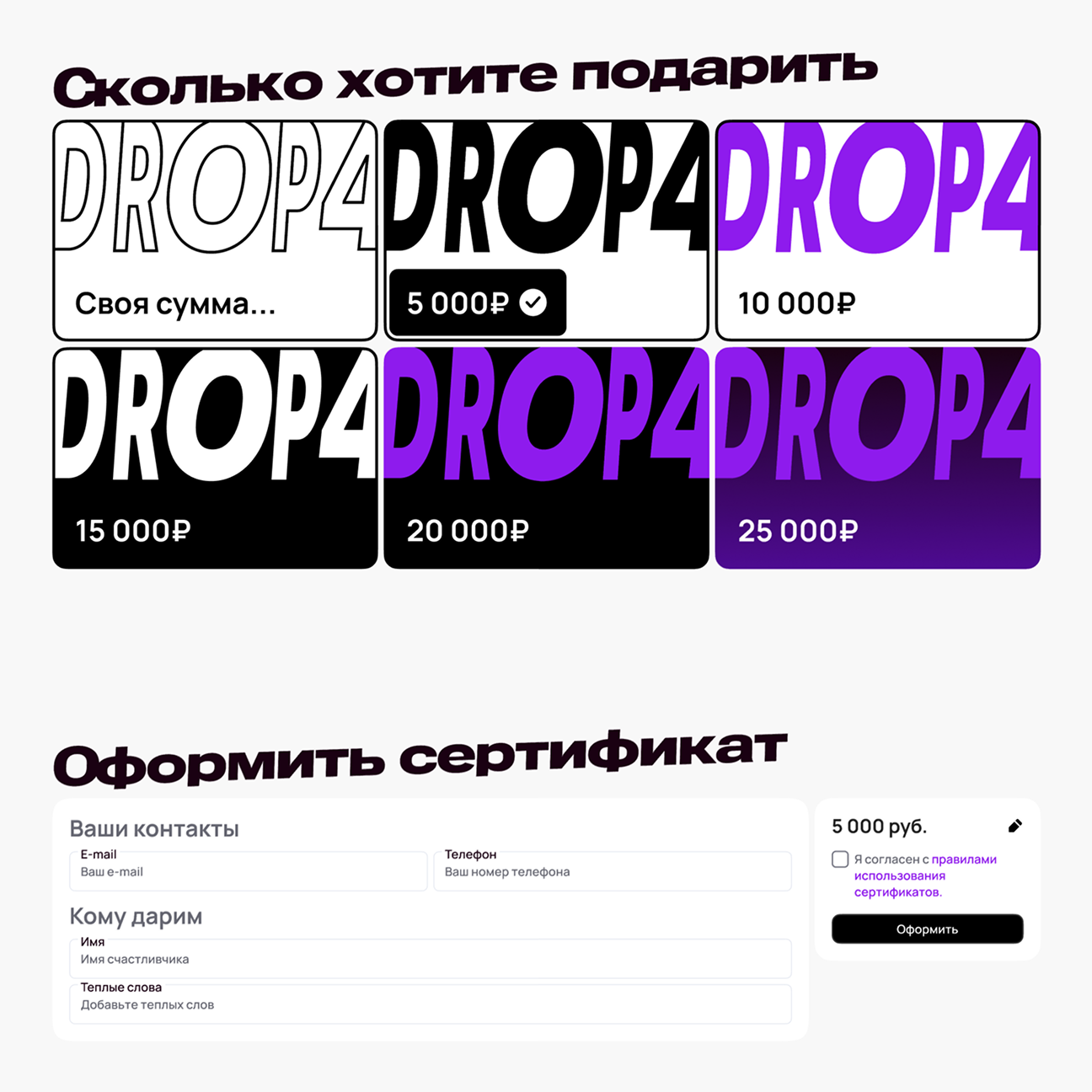
To increase conversion and repeat purchases, a dedicated gift card flow was designed.
Users can choose a fixed amount or set a custom value —
the interface behaves like an input with instant recalculation.
Gift cards are purchased and activated immediately,
stored in the personal account, have an expiration date,
and support partial redemption with balance preserved for future orders.
Gift cards
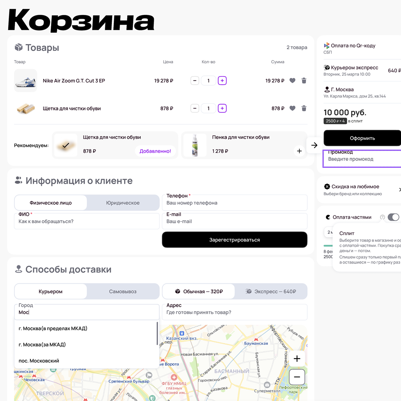
Cart
The cart combines purchase and registration into a single flow.
When entering a confirmation code, the button changes state,
and after the timer expires, a resend option appears.
This allows users to complete the flow without unnecessary screens or breaks.
Additional recommendations (accessories and shoe care products)
are integrated subtly and do not distract from the main action.
Cart
Delivery, addresses, and map
Delivery addresses are synchronized with the map:
when typing an address, it appears on the map instantly,
and selecting a point automatically fills in the form fields.
Both courier delivery and pickup points are supported.
This approach reduces errors and speeds up checkout.
Account
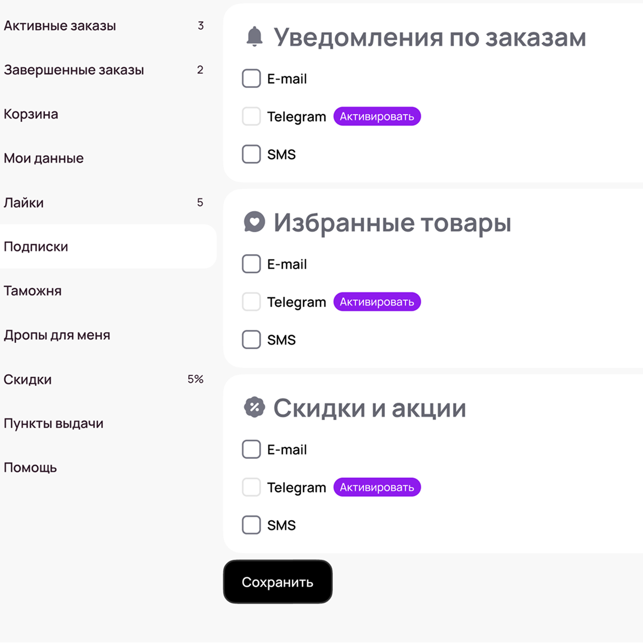
Subscriptions and notifications
Users can flexibly manage notifications for orders, discounts, and favorite products.
Email, SMS, and Telegram are supported.
The save button appears only when settings change —
the interface stays calm and avoids unnecessary pressure.
Notification settings
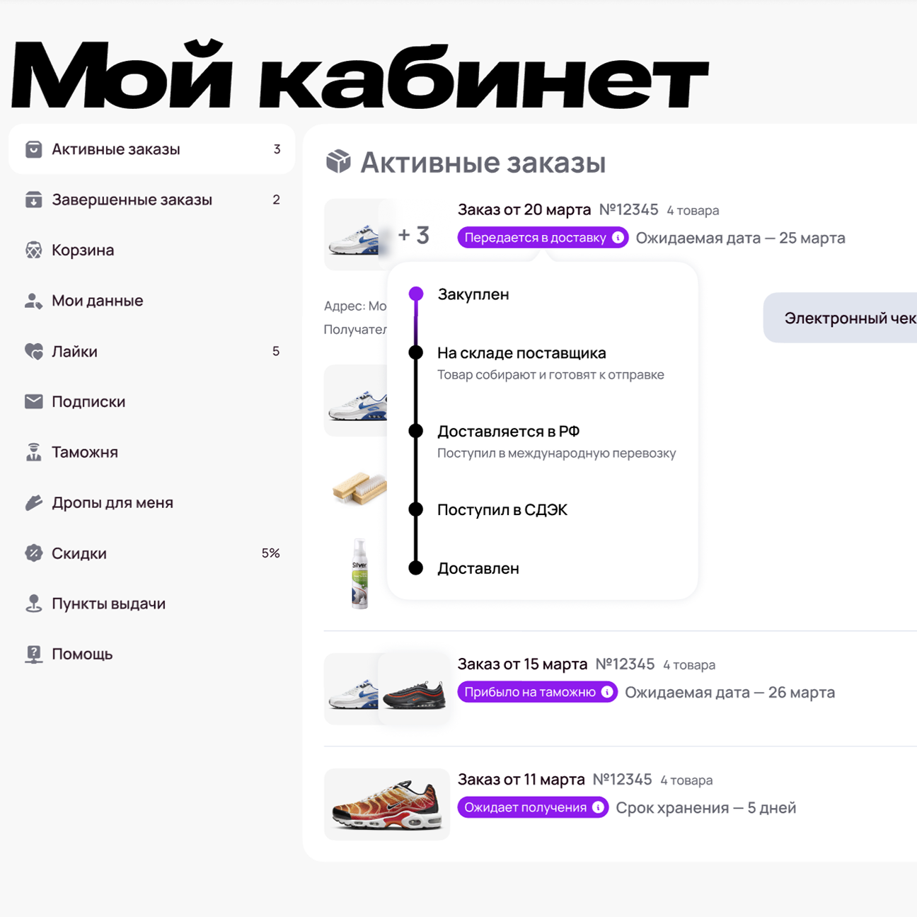
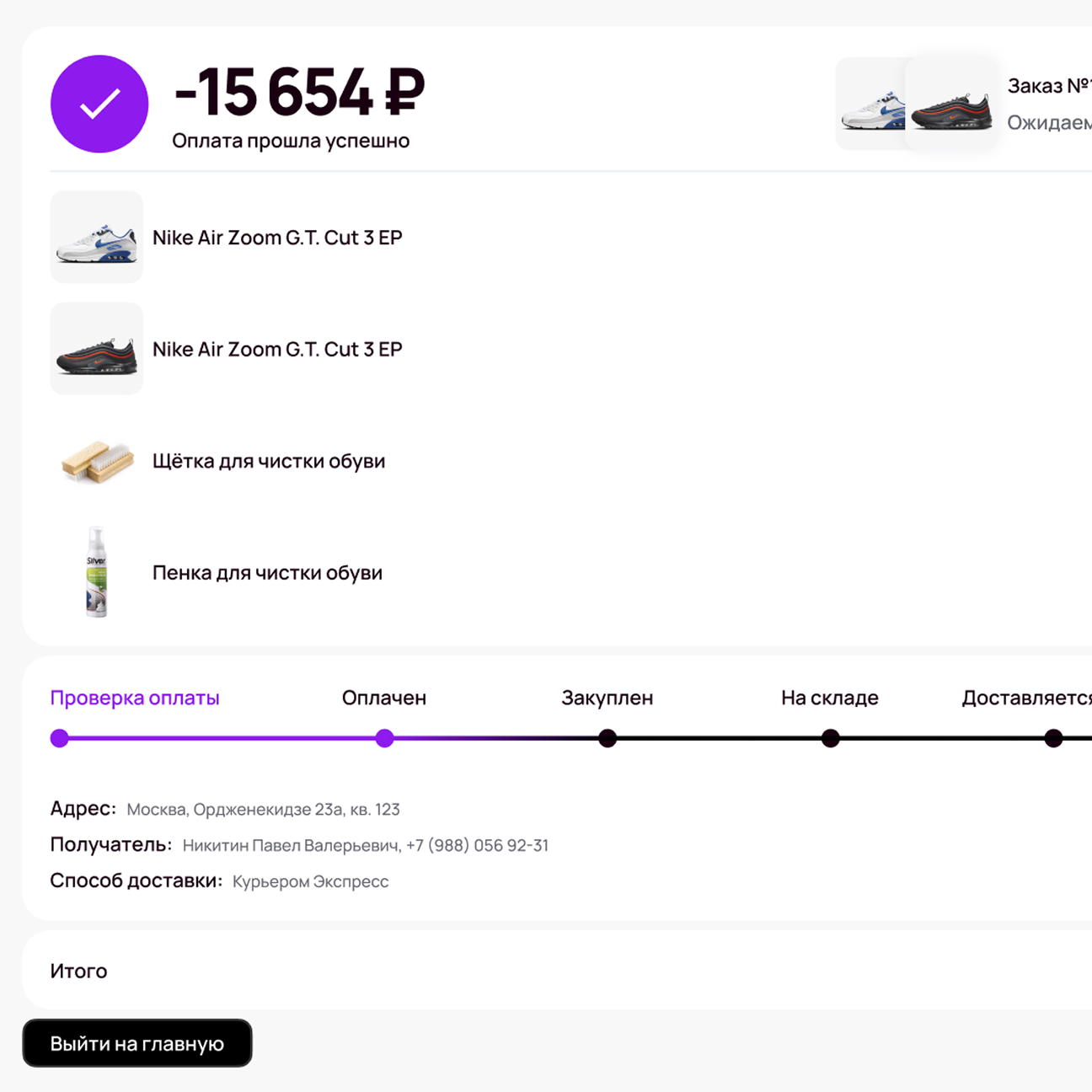
Orders and split payments
The order flow is detailed down to state level.
Users see the full lifecycle of an order — from payment verification to delivery.
The timeline adapts depending on the delivery method (courier, pickup point, post).
Yandex Split integration is native:
the payment schedule is displayed directly in the order,
amounts are recalculated automatically,
and statuses are synchronized with the overall product logic.
Order
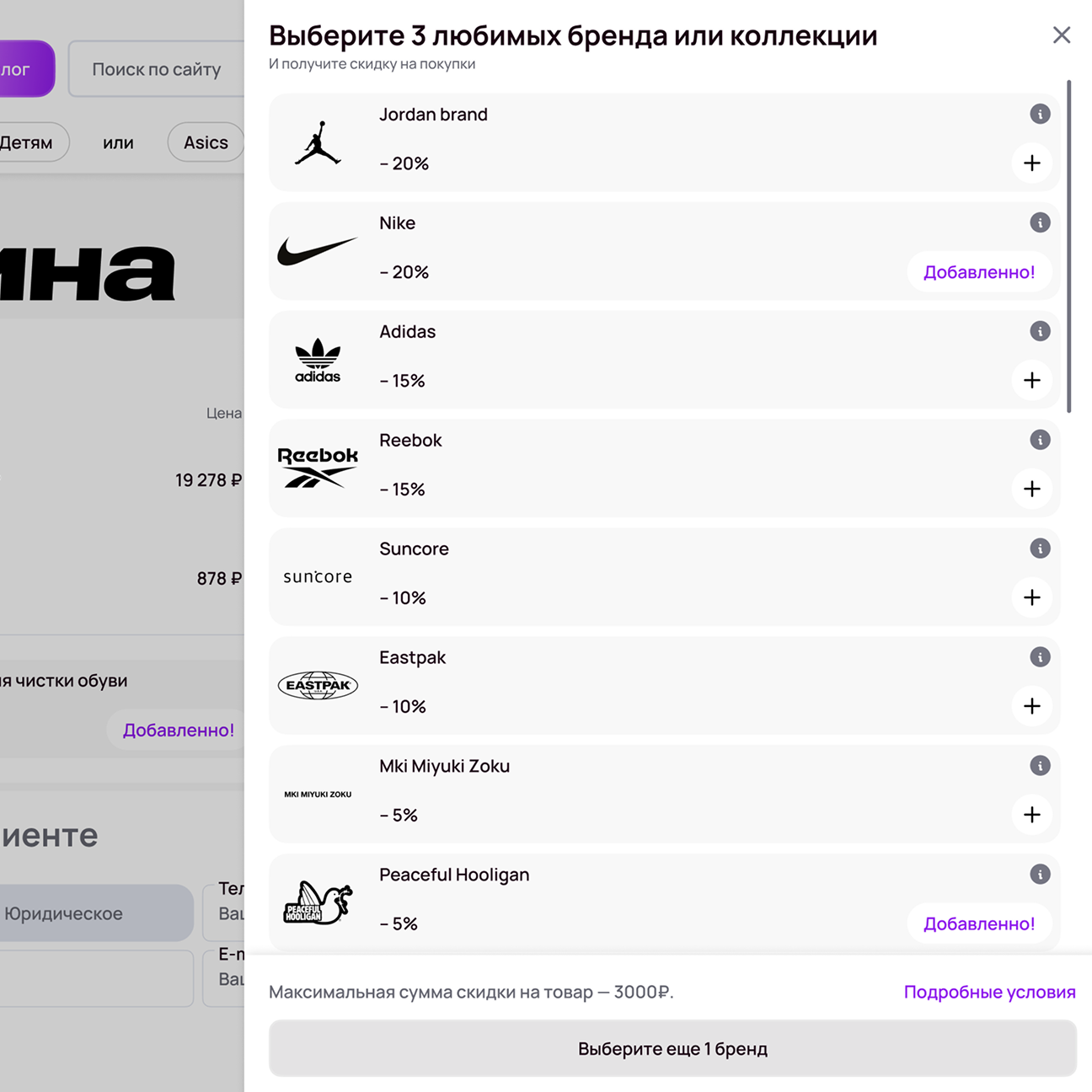
Discounts and favorite brands
The discount system is not limited to promo codes.
Users can select favorite brands or collections —
the logic works like checkboxes, with fast and reversible changes.
Conditions and limitations are shown directly in the interface,
without hidden rules. This increases transparency and trust.
Discounts
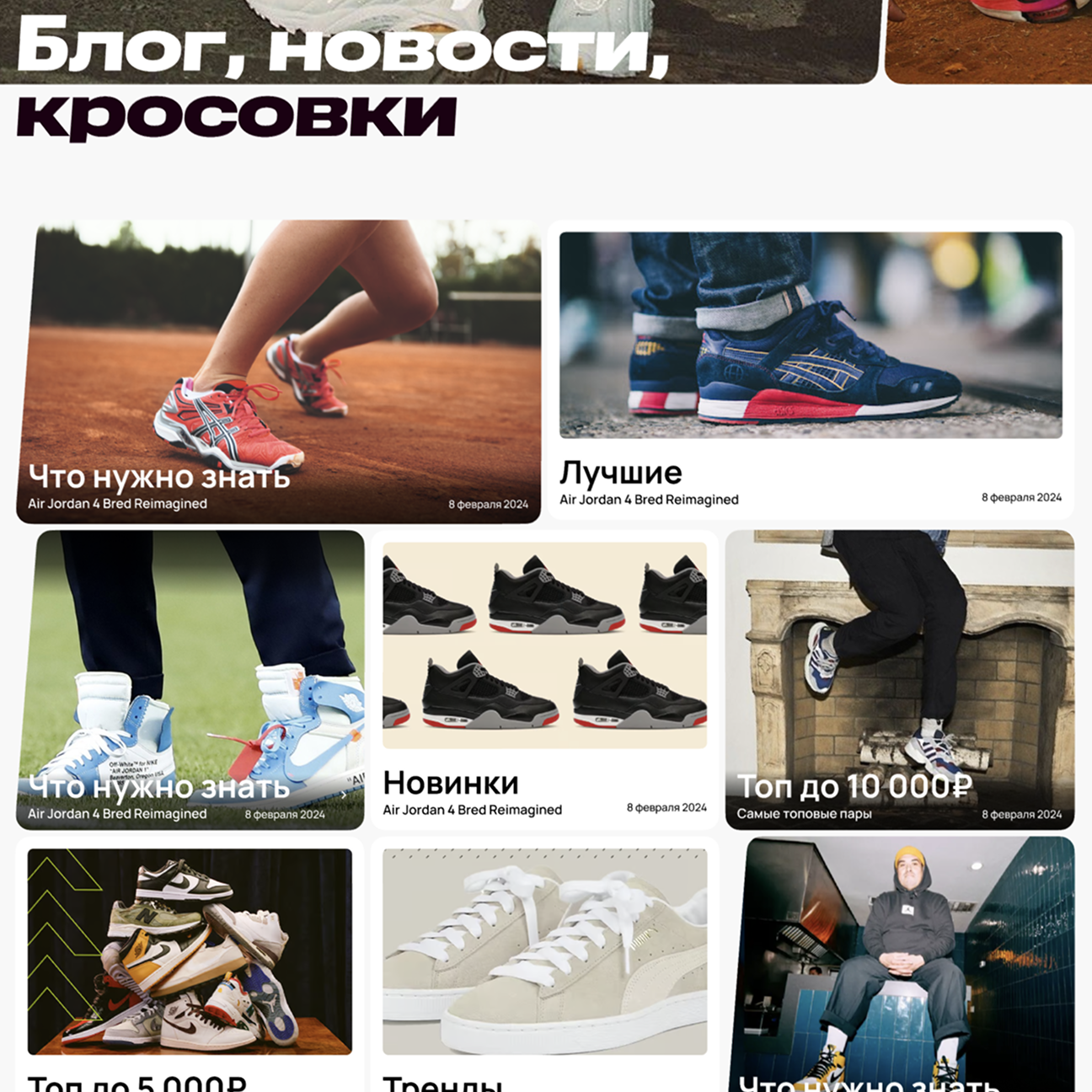
Content and blog
The product includes a blog with news, selections, and guides.
It acts as an additional entry point to the catalog:
articles link to specific models, trends, and price selections.
Content strengthens the brand and increases engagement time.
Blog
Takeaways
Drop4you is a commercial e-commerce product designed as a cohesive system.
There are no random screens: every scenario is built from first contact to post-purchase.
My main goal was to create a seamless flow that minimizes friction on the path to purchase
while supporting fast product growth.
This case reflects work not just with visuals,
but with interface architecture and behavior in a real business context.
I focused on mobile experience and optimization of critical points:
cart, checkout, and product filtering.
Instead of one-off solutions, I implemented a modular component system
that allows scaling the assortment and adding new features without reworking core logic.
The result is a tool where design directly supports speed and convenience of purchase,
while remaining visually clean and predictable for users.